pygad.visualize Module
The pygad.visualize.plot.Plot class is mixed into pygad.GA. Each method below is callable on a GA instance after run().
Every method returns the matplotlib.figure.Figure it created and optionally writes it to disk via save_dir. A runnable script for each plot lives under examples/plots/.
Plot inventory
Method |
Works for |
Needs |
|---|---|---|
|
SOO + MOO |
no |
|
SOO + MOO |
yes |
|
SOO + MOO |
yes ( |
|
MOO (M=2 or M=3) |
no |
|
MOO (any M >= 2) |
no |
|
MOO (any M >= 2; best for M >= 4) |
no |
|
MOO (any M >= 2) |
no |
|
SOO + MOO |
yes |
|
MOO |
yes |
|
SOO + MOO |
yes |
|
MOO (M=2 or M=3) |
yes |
Every method requires at least one completed generation. Each one raises RuntimeError with a clear message if it is called too early, on a single-objective problem when MOO is required, or without the save_solutions flag when one is required.
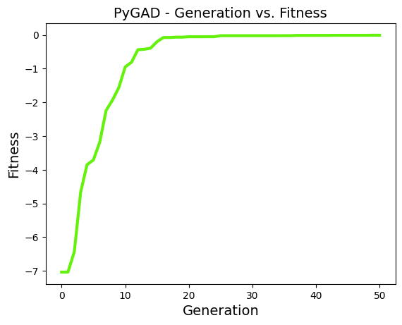
plot_fitness()
Best fitness per generation. For MOO, one curve per objective on the same axes.
Parameters: title, xlabel, ylabel, linewidth, font_size, plot_type ("plot" / "scatter" / "bar"), color, label, save_dir.
ga_instance.plot_fitness()
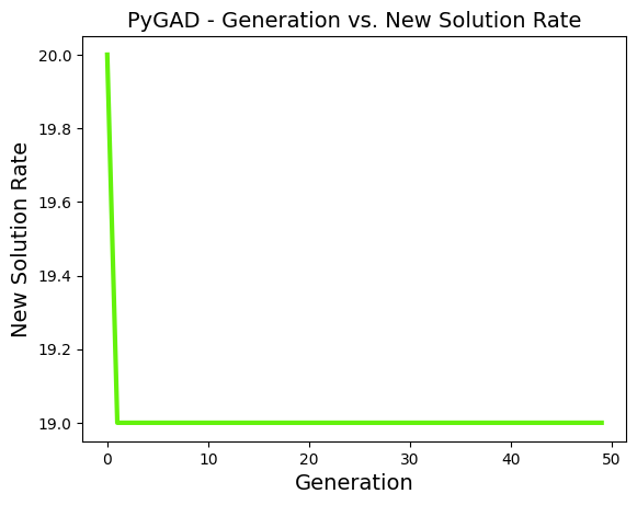
plot_new_solution_rate()
Number of previously-unseen solutions per generation. A flat curve means the GA is repeating itself; a high curve means it is still exploring. Requires save_solutions=True.
Parameters: title, xlabel, ylabel, linewidth, font_size, plot_type, color, save_dir.
ga_instance.plot_new_solution_rate()
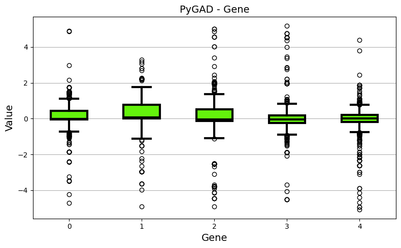
plot_genes()
One subplot per gene showing how that gene drifts across generations. Three views: line per gene (graph_type="plot"), per-gene boxplot, per-gene histogram.
Use solutions="all" to plot every saved solution (needs save_solutions=True) or solutions="best" to plot only the best solution of each generation (needs save_best_solutions=True).
Parameters: title, xlabel, ylabel, linewidth, font_size, plot_type, graph_type, fill_color, color, solutions, save_dir.
ga_instance.plot_genes(graph_type="boxplot")
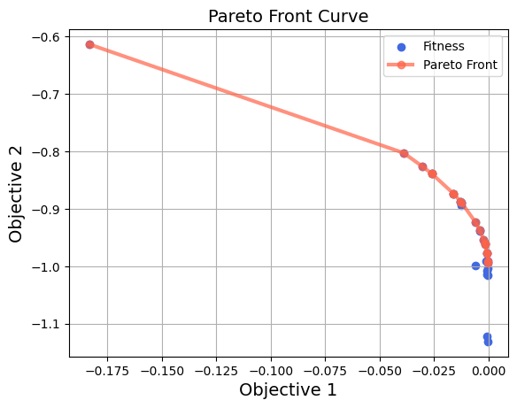
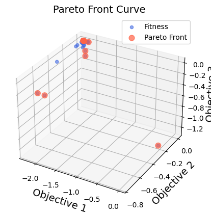
plot_pareto_front_curve()
Pareto front of the final population. With 2 objectives it draws the population as a scatter and connects the non-dominated points with a curve. With 3 objectives it switches to a 3D scatter and highlights the non-dominated points. With 4 or more objectives it raises and points to the high-dimensional plots below.
Parameters: title, xlabel, ylabel, zlabel (only used for M=3), linewidth, font_size, label, color, color_fitness, grid, alpha, marker, save_dir.
ga_instance.plot_pareto_front_curve()
For M=2 (NSGA-II on ZDT1):
For M=3 (NSGA-III on DTLZ2):
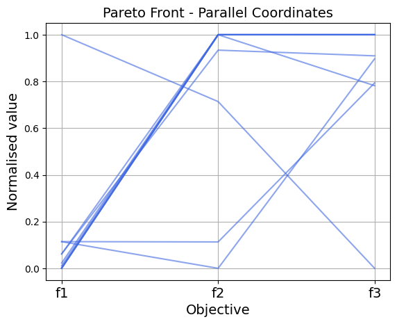
plot_pareto_front_pcp()
Parallel-coordinates view of the final non-dominated set. Each objective is a vertical axis. Each non-dominated solution becomes a polyline that crosses every axis. Values are normalized per objective so very different scales remain comparable. Useful for any M >= 2 and especially for M >= 4.
Parameters: title, xlabel, ylabel, linewidth, font_size, color, alpha, grid, save_dir.
ga_instance.plot_pareto_front_pcp()
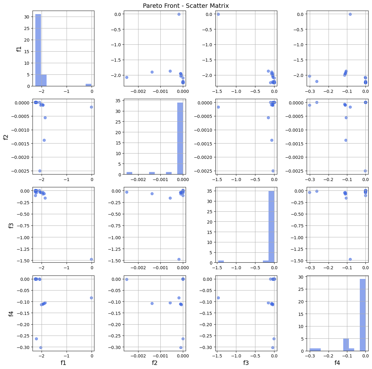
plot_pareto_front_scatter_matrix()
M-by-M grid of pairwise scatter plots for the final non-dominated set. The diagonal shows a histogram of each objective. The best fit when M >= 4 and a single 3D scatter no longer reads well.
Parameters: title, font_size, color, marker, alpha, grid, save_dir.
ga_instance.plot_pareto_front_scatter_matrix()
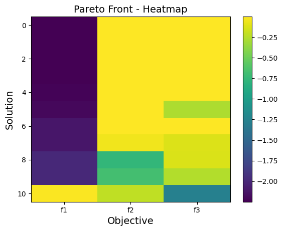
plot_pareto_front_heatmap()
Heatmap of the final non-dominated set. Rows are solutions, columns are objectives, color is the raw objective value. Rows are sorted by objective sort_by (default 0); pass sort_by=None to keep the original order.
Parameters: title, xlabel, ylabel, font_size, cmap, sort_by, save_dir.
ga_instance.plot_pareto_front_heatmap(sort_by=0)
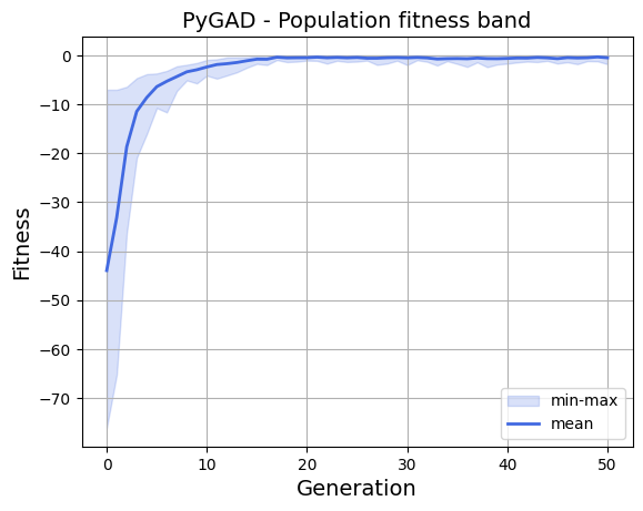
plot_fitness_band()
Per-generation min, mean, and max with a shaded min-max band. Reveals selection pressure and diversity collapse at a glance. For MOO, pick one objective via objective_index (default 0). Requires save_solutions=True.
Parameters: title, xlabel, ylabel, font_size, color, band_alpha, linewidth, objective_index, grid, save_dir.
ga_instance.plot_fitness_band()
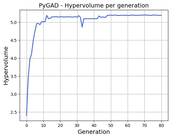
plot_non_dominated_hypervolume()
Hypervolume of the non-dominated set per generation. Uses pygad.utils.quality_indicators.hypervolume. Pass reference_point explicitly, or let the method pick the column-wise min across all saved generations minus 0.1. Requires save_solutions=True.
Parameters: reference_point, title, xlabel, ylabel, font_size, color, linewidth, grid, save_dir.
ga_instance.plot_non_dominated_hypervolume()
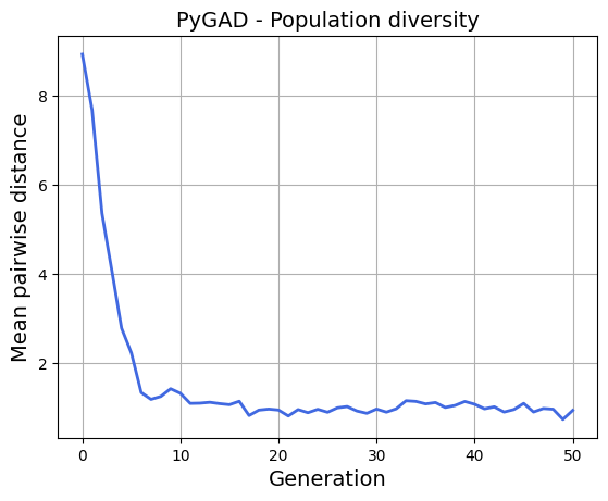
plot_population_diversity()
Mean pairwise Euclidean distance between solutions per generation. A drop signals the population is converging or collapsing into duplicates. Requires save_solutions=True.
Parameters: title, xlabel, ylabel, font_size, color, linewidth, grid, save_dir.
ga_instance.plot_population_diversity()
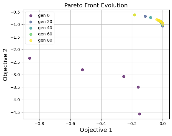
plot_pareto_front_evolution()
Overlays the non-dominated set every every_k generations on a single figure. The colormap goes from early to late so you can see the front converge. Works for 2 or 3 objectives. Requires save_solutions=True.
Parameters: every_k, title, xlabel, ylabel, zlabel, font_size, cmap, marker, alpha, grid, save_dir.
ga_instance.plot_pareto_front_evolution(every_k=20)